zoom interface

Sometimes the best interfaces are the simplest: take this touch screen interface for the NTT ICC (Tokyo) entitled Micro Presence by Kenji Kohiyama, masahiko Morita, Tatsuya Saito and Shuheu Wemler from Keio University. Having photographed insects at super-high resolution, the best way to engage visitors was to show the insects real size and allow anyone to zoom in as far as possible. Forgoing a ‘pinch’ type interface for a much simpler single touch zooming animation, the interface is accessible by anyone. And despite all of the other things people might want to do with the image (rotate, revolve) allowing only this one gesture with a single animation speed makes it engrossing enough. From the catalogue:

The limits of human perception are often issues of scale: it is difficult for us to appreciate that which is inordinately larger or smaller than ourselves. The history of humanity is filled with tools and theories to help us calibrate our observations and understand other proportions in nature. This installation attempts to make visceral the microscopic in our daily lives. Because these insects are exceedingly small, we tend to co-exist without any sense of their existence. By re-proportioning them to the scale of a human body, they start to make their extraordinary presences felt. To make vivid the presence of these microscopic beings, this piece makes full use of the latest digital image processing technology, and has even developed new photographic techniques for achieving focal depth on each region of their bodies.
Posted in 2d, animation, art, universal design, visualization | Comments closed

carbon fiber kitchen

carbonfiberkitchen1

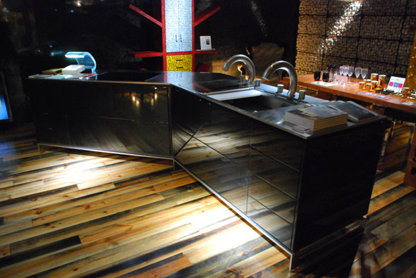
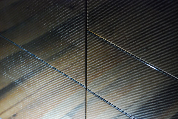
Move over stainless steel: I spotted this carbon-fiber kitchen island in the Tokyokitchen gallery at the Axis building in Roppongi. When I used to work with kitchen manufacturers I learned that most people only buy new cabinets every twenty or thirty years. Considering the weight and size of most kitchen cabinetry, there is a major benefit in designing a kitchen that lasts forever. In addition, carbon fiber is a craft: experts have to lay the material and polish it almost entirely by hand. So, while it may be overkill, this choice of material has distinct advantages over the particle board and stainless steel of current kitchens. I just don’t know how much it costs.

carbonfiberkitchen2

Posted in energy, environment, fabrication, furniture, materials | Comments closed

tunnel of light

Anthony McCall’s You and I, Horizontal is a stunning if very simple installation at the NTT ICC in Tokyo: a single projection of a slowly changing line is transformed into a space of light. The projected light is enhanced by a fog machine in a darkened room so that the shaft of light can be experienced as an interior space. You can see from the video how bodies enter and leave the space by walking through the veils of the projection, breaking their continuity. It’s a moving experience. From the catalogue description:

Entering the space, the viewer faces a seemingly immaterial and yet three-dimensional body of light, realized by projecting light onto a delicate mist. On the wall a line extends so slowly that it is almost imperceptible to the eye. The immaterial 3D sculpture gradually changes form and scope. By passing through, inside and outside of the almost-tactile light “membrane”, you become receptive to a new perceptual experience, influencing the work’s sculptural aspects and scope. This work is the realization of an early 70s experimental installation using the technology of today.

Posted in art | Comments closed

eye of the beholder

eye11eye21

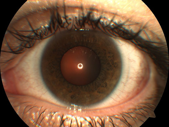
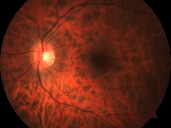
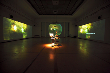
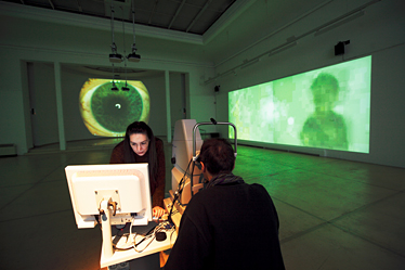
While in Tokyo last week I was lucky to visit the Light Insight exhibit at the NTT ICC, and I’ll be posting about several of the pieces over the next couple of days. The first one to strike me was the Thought Projector by alien productions. The installation projects room-sized images of the viewer’s eye captured by an attendant with an ophthalmology camera. The images are captured and transmitted to the web, where a running database keeps track of all the eyes on the piece. Experiencing the piece is a moving, if ultimately narcissistic experience, as you stare into the giant image of your own eyes. Here is the description from the catalogue:

This installation was inspired by an unrealized concept for “a camera to photograph the thoughts of its subject (through their retina)” mentioned by inventor Nikola TESLA* in 1933. First, the participant sees high-resolution magnified images of the surface and rear of their eye projected on the front wall created through a three-step process. Second, the image is projected on the left wall as overlaid on imagery from an archive prepared by the artists and streamed on the Internet. Thirdly, the result is projected on the right wall, along with comments from Internet viewers.

thoughtprojector1
thoughtprojector2

Posted in art | Comments closed

money pollutes

colorblind

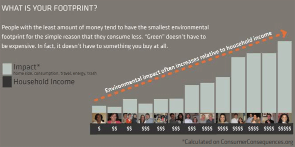
Last Fall Grant Kristofek (“sustainability champion” at Continuum, the industrial design powerhouse responsible for the Reebok Pump and the OLPC) co-authored a report entitled Colorblind: How Consumers See Green. A team of designers, ethnographers and engineers visited households all over the US to document the attitudes that govern how we think and act with regard to the environment. Their studies include a set of priceless ethnographic interviews that reveal how little even educated consumers understand concepts such as footprint and global warming. They conclude that environmental impact has much more to do with income level than with intention or a true understanding of the problems. People who spend a lot of money have a much larger impact than those that consume less, regardless of how much they care. And it makes sense: people with more money have more stuff, bigger houses and they travel more. It appears that consumption pollutes, regardless of where it’s directed. The real challenge will be how to make people spend money without making them buy more stuff – something designers will have to wrap their heads around for a long time to come.

The conclusions from the study:

-People care about people; the environment only matters when it directly affects them. People care more that a natural pesticide, free of toxins, is safe for their family than safe for the environment.We need to tell them the whole story.

-We learned that people view the environment as abstract; as the place they occasionally “go out into,” not the place where they live. To engage people more with the environment, a stronger connection needs to be made to their everyday lives.

-People’s ideals were often inconsistent with the reality of their actions.Many beliefs they held about how to treat the planet were not carried out at home. Often it was the obvious, visible activities, such as recycling, that did receive their attention.

-Being green and buying green don’t go hand in hand. Those with lower income levels live more sustainably not necessarily for the benefit of the environment but simply because they consume less. Although living sustainably or being “environmental” is perceived as expensive, what we witnessed was quite the opposite.

Posted in energy, environment, product design | Comments closed

map embroidery

mapcard

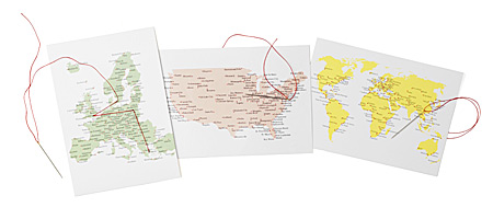
The web has transformed maps into a dorm of personal expression: once used exclusively for personalized directions, online maps have become tools for scrapbooking and sharing our experience in social networks. We can see the influence of distributed online cartography in our real-world communications, such as these stitch cards that encourage the tourist to delineate their trajectories as a form of interpersonal communication.

via

Posted in futurecraft, maps, visualization | Comments closed

cereal craft

megoji

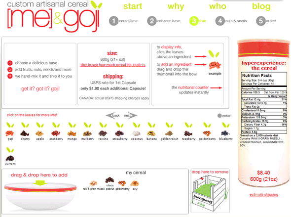
Mass Customization is generally thought of as a technological triumph combining the quality of the made-to-order with the efficiency of the mass-produced. Recently, it has been proposed that mass customization could also be desirable in terms of sustainability. Custom goods are always made on-demand, reducing inventory and waste. They may also warrant higher prices and be treated with more respect; and they are rarely disposable. Of course, food has always been customized: everyone recognizes the value of a freshly cooked meal at neighborhood restaurant sourced from local produce. But it has been impossible to mass-customize food, until now: me&goji provide a software tool to design and brand your own cereal on-line (above). They will then pack and ship it to you from New Hampshire (carbon-free for an extra dollar). Is this a better solution that mixing bulk ingredients at your local market? Probably not. But it points the way toward a new value proposition, where consumers are involved in tracing (and designing) products, based on an informative web-based interface.

via

Posted in customization, energy, environment, fabrication, food | Comments closed

renaissance map

davincimaps2

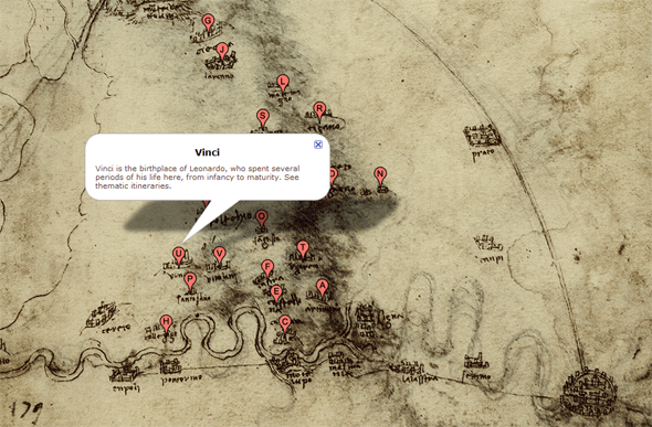
While visiting the Institute and Museum of the History of Science in Florence last year, Director Paolo Galluzzi treated us to a sneak peek inside a new feature on his musem’s media-rich web site: maps drawn by Leonardo da Vinci scanned and posted in a Google maps interface so we could compare the renaissance originals with modern cartography. It is all a part of his philosophy that making the museum’s entire collection available on-line is not just good for business, but it could allow new forms of research into the history of science – something that will directly impact future research. At first glance it’s quite clear that the maps have lost something over the centuries as they became slightly more accurate. But this project holds a tremendous amount of promise – imagine if the web’s collective intelligence could be applied to research through more tools like this one, exposing artwork long stored in museums and libraries to intellectual scrutiny and discovery!

Posted in art, blogogracy, free & open, maps, visualization | Comments closed