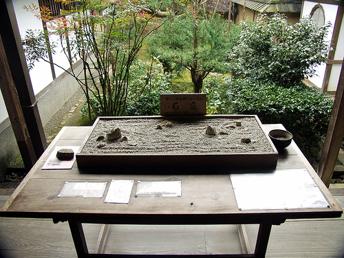
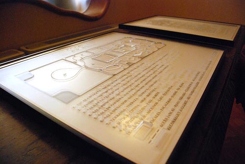
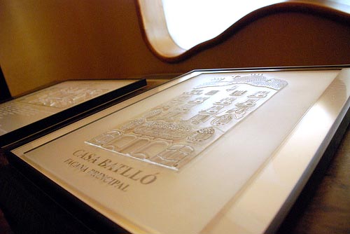
twice now i have come across touch-based maps for people visiting famous sites to be able to appreciate architectural elements without the use of sight. the miniature of ryoanji temple’s rock garden allows visitors to appreciate the unique and harmonious layout of stones (which is designed so that all are never visible from any one vantage point). the two relief drawings of gaudi’s casa batllo overlay a print with a ridged clear plastic sheet. the best part about adding tactile information to a visual and spatial marvel is that it is useful whether or not you have sight, in part because touch is an under-utilized sense.
touch museum
This entry was posted in perception, product design. Bookmark the permalink. Both comments and trackbacks are currently closed.


2 Trackbacks
[…] is another example of a universal design map in the tokyo subway to reveal not only names in braille but also the […]
[…] is another example of a universal design map in the tokyo subway to reveal not only names in braille but also the […]