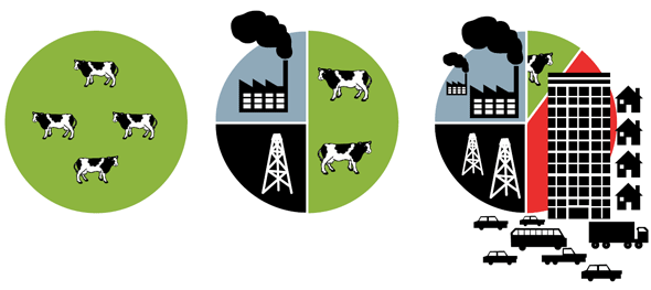
Nigel Holmes’ illustrations for the Citizens Guide to the Airwaves
Advocacy groups today need direct control over the way data is presented, often creating custom visualizations to communicate about systemic issues. Tom Longley of Tactical Tech introduced me to his group’s beautiful guide to information visualization for advocacy (available for download in pdf) – a must-read for anyone trying to rally many people around a complex cause. Here are a few of the great examples contained within:

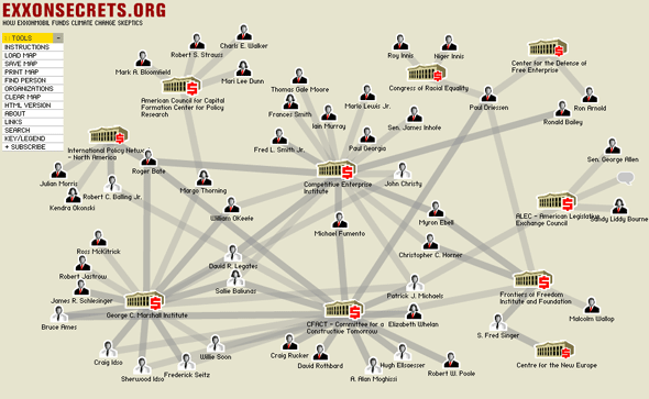
Greenpeace’s maps of corporate influence at Exxon Secrets

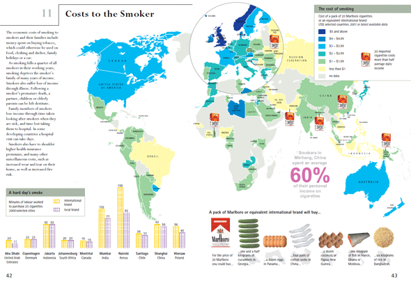
The World Health Organization’s Tobacco Atlas

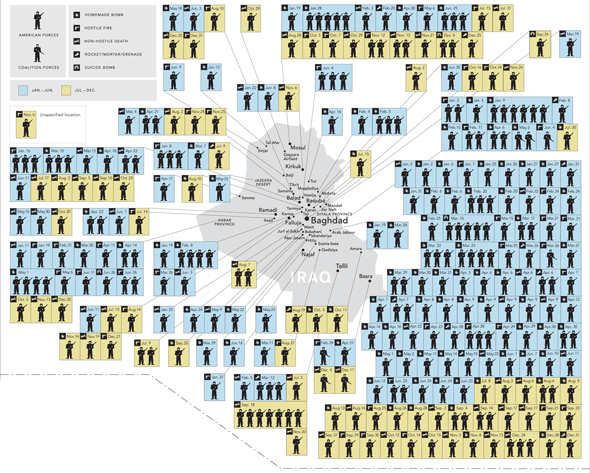
Adriana Lins de Albuquerque and Alicia Cheng’s A Year in Iraq and Afghanistan in the February 2007 New York Times
2 Trackbacks
[…] https://www.hyperexperience.com/?p=1931 […]
[…] https://www.hyperexperience.com/?p=1931 […]