
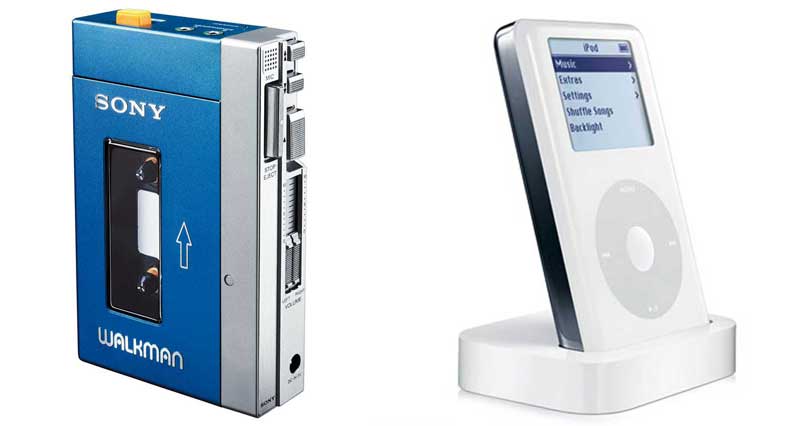
in today’s new york times magazine rob walker talks about the new fire extinguisher on sale at the home depot – the home hero – which replaces our old extinguishers with something more ‘designer.’ presumably the aesthetic appeals to design-conscious consumers who will be more likely to keep it at hand – although there is no evidence of this. recently it seems like making anything out of white plastic – with rounded edges – means ‘design.’ i totally disagree. there is a lot of design in the old extinguisher, namely that it could be seen, understood and used in a pinch. it’s a universal symbol. and the new extinguisher is not good design – it’s just bland. lately, it seems like design means the type of simplicity that obfuscates the function of an object to make it seem ‘better’ than the competition. i guess it all started with the walkman2.0, a blander version of the original. the walkman and the original fire extinguisher each have a unique design language. how good will ‘design’ be when everything looks the same?
3 Trackbacks
[…] (which makes a de facto claim that stylish aesthetics are a virtue) comes from the site hyperexperience: “Recently it seems like making anything out of white plastic – with rounded edges – means […]
[…] far have we come? ipods are supposed to be the best design of today, yet they’re more plain than a walkman was twenty years ago. just look at the walkman docks of 1984: they were colorful, re-configurable and even […]
[…] far have we come? ipods are supposed to be the best design of today, yet they’re more plain than a walkman was twenty years ago. just look at the walkman docks of 1984: they were colorful, re-configurable and even […]